
How to Measure your AI Chatbot and Top Metrics to Track
How Amazon Uses Data Science to Package Products
Multi-Layer Mapping in Tableau: Finding The Best of Fall Foliage in Toronto
I have had the good fortune to travel A LOT, and no matter where I’ve been around the world – nothing beats the Fall foliage in Ontario. I love the red, yellow and purple changing leaves of the fall and want to see them every chance I get. I’m trying to limit my travels outside of the city, and sticking to area’s walking distance to me.

Destination Canada. (https://www.seetorontonow.com/attractions/fall-colours-in-toronto/)
When we use maps in practice, it is very rare that one layer will capture all the information we are looking for. In addition to pinpointing a location, we may also want to see a breakdown of sales for that location with a pie chart, or how many locations fit within a boundary.
I took a data set from https://open.toronto.ca/ with information about trees planted around Toronto, and another dataset with the neighbourhoods that make up the city. I combined this with a separate data set that signals the colour leaves will change based on the type of tree. I will use these datasets to determine where my peak fall foliage will be based on their location.

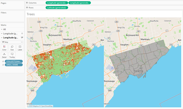
I first connect my dataset to Tableau Desktop and map out each of the trees.

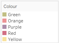
I then apply my Fall Foliage Palette to match the tree colours across the city and changed the Map Layer to Street.
That already looks beautiful! I made sure to add the Record_ID and Tree Name onto detail so I could create a circle in place of each tree, make the size of the points smaller and lowered the opacity so we can see any overlapping trees.
I’m not entirely sure what neighbourhood to go to, to see these changes, so I’m also going to map my neighbourhoods in a different sheet.

As you can see, I have two separate maps, one with the trees and another with the neighbourhood boundaries. In order for me to bring them together and create a dual map layer, I am going to utilize dual axes.
Return to the map with the trees, and hold control to create a copy of either Latitude or Longitude, it doesn’t matter which one you choose. Now I have two of the same map, but I also have two marks cards. And we know that we can format each mark individually. I am going to take off all my tree information on the map and replace it with the geometry of the neighbourhoods.
I still have two separate maps side by side, but they are displaying two separate layers. In order to bring these layers together, I can right-click on one of the repeat Latitude or Longitudes and select Dual Axis.
Voila! My maps are layered on top of one another.
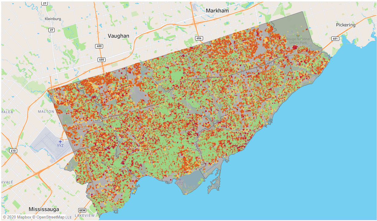
You can play around with the ordering to have the trees on top of the boundaries, try adding a filter for neighbourhood and tree color to narrow down your search. I personally want to see those rare purple trees in the Beaches area, and now I know exactly where to go to see them.
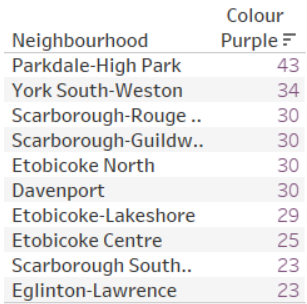
If you’re also looking for those rare purple trees, here is a list of the top 10 neighbourhoods to find them!
I have some even better news for you.
Recently announced at the Tableau 2020 Conference-ish, Map Layers are going to be a standard in Tableau Desktop! Instead of creating a dual-axis, we will be able to bring our separate geometry right on top of the first until Map Layers appears. Drop it on the map and see the same magic, in half the time. The other cool feature is you can add as many layers as you want. Want to see what subways go past the foliage? Add that as a tertiary layer, and as always, try it for yourself!
Want to learn more tips and tricks like this in Tableau? Check out some of our official Tableau training courses that I teach regularly. You’ll get a chance to join me online and learn from real-world examples like this one. From data prep to visual analytics – we’ll turn you into a data rockstar regardless of your technical or analytical background. Reach out to learn more.
Written By:
 |
KATHLEEN SONGIN, DATA ANALYTICS LEAD
|
Kathleen is a Data Analytics Lead at Newcomp Analytics. She believes data visualization, like Tableau, holds tremendous value in making information accessible and continues to enable users from data beginners to experts alike to become data rockstars.
Read more posts from our blog


