
Try Adding Animations in Tableau!
Where Should I Move?
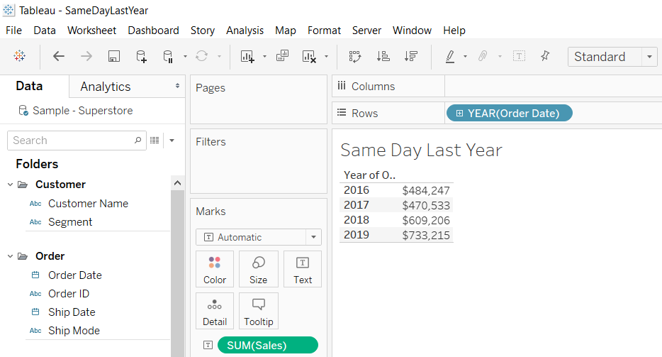
Same Day Last Year (SDLY) Analysis in Tableau
As seasons fluctuate, so does our data, leading us to draw patterns in consumer buying habits. In order to gauge how our data is performing, we need to compare historical trends and points of interest. A Same Day Last Year (SDLY) analysis is a great way to determine how much we have increased, or decreased, around the same seasonal conditions. Moreover, we will take only the maximum date from the data available to us to create this analysis, rather than TODAY().
Connecting to Sample – Superstore, bring in Order Date and Sales, to determine our data availability.
Normally, when we compare SDLY, we use integrated Tableau Functions like TODAY() or relative date filters. Your data may not always reflect the current date, it may be a week delayed, or not count the weekends. In order to account for this, we will create our own relative date, reflective of the current data set, instead of the date reflected on your desktop.
Create a calculated field called Max Available Date.
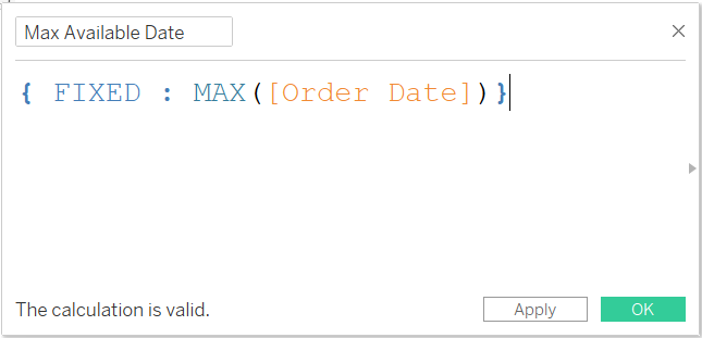
This Level of Detail (LOD) calculation will display the maximum date as available by the data set. This will be used to determine the ‘current’ Day and Month.
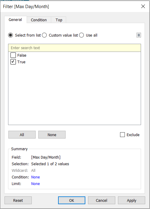
Create another calculated field called Max Day/Month.
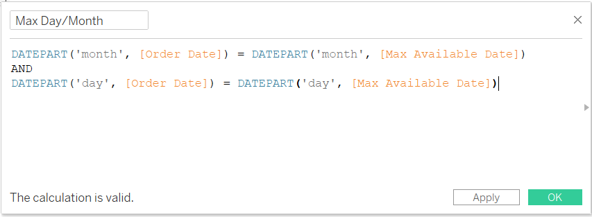
This calculation is used to determine the specific data and month based on the most recent data that has been brought in. This calculation results in a T|F field that is used as our relative filter, relative to the data available to us.
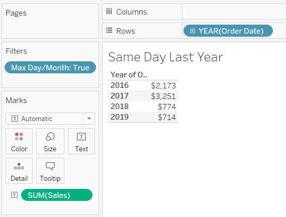
Bring Max Day/Month onto the filter and all the conditions to be true.
Now our data is showing the sales for the Month and Day most recent in the data set.
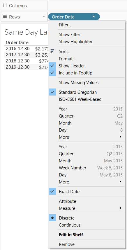
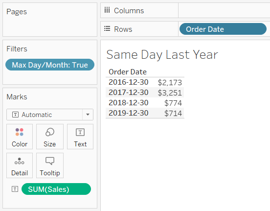
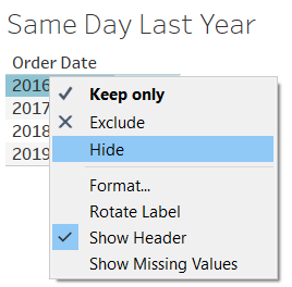
To determine what date that is, change the Order Data to Exact Date and switch it to Discrete.
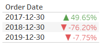
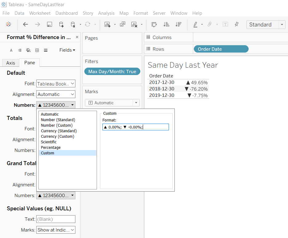
Utilization of Tableaus Quick Table Calculations can be used to further determine if Sales have increased or decreased by percentage for that particular Day.
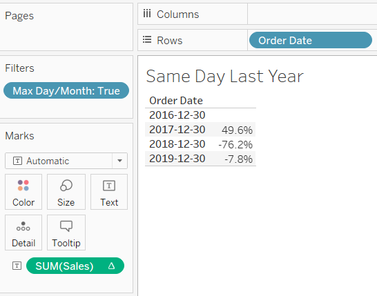
By adding the filter, we will see the individual Sales for “today” according to our data set. To make this suitable for an Executive Dashboard, hide any null fields.
Now, we have a Same Day Last Year Analysis on YOUR data set.
Take this a step further by adding an arrow to your results determining if Sales have gone up or down. Format the Sales Quick table calculation and create a custom format: ▲ 0.00%; ▼-0.00%;.
BONUS: Add some colour, drag the Quick Table Calculation to the Data Pane and create a Calculated field that will be green if sales have gone up, and red if sales have done down.
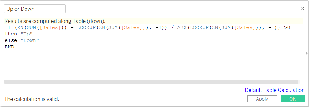
Drag the new field onto Color, and edit the colours accordingly. If needed, change the Format of Sales again.
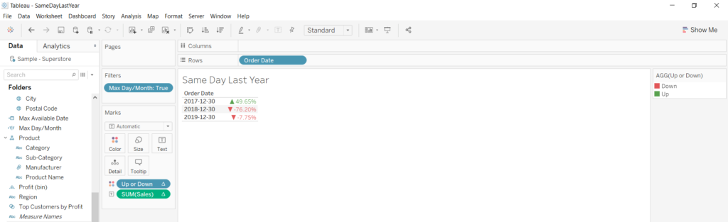
And there you have it! Your very own SDLY analysis on your data set.
Written By:
 |
KATHLEEN SONGIN, DATA ANALYTICS LEAD
|
Kathleen is a Data Analytics Lead at Newcomp Analytics. She believes data visualization, like Tableau, holds tremendous value in making information accessible and continues to enable users from data beginners to experts alike to become data rockstars.
Read more posts from our blog


